Why the 2026 AT Standard is Essential for Webtoon Accessibility
Discover the 2026 AT Standard: a new framework for adaptive typography that ensures webtoons are accessible to neurodivergent readers and mobile-first audiences.
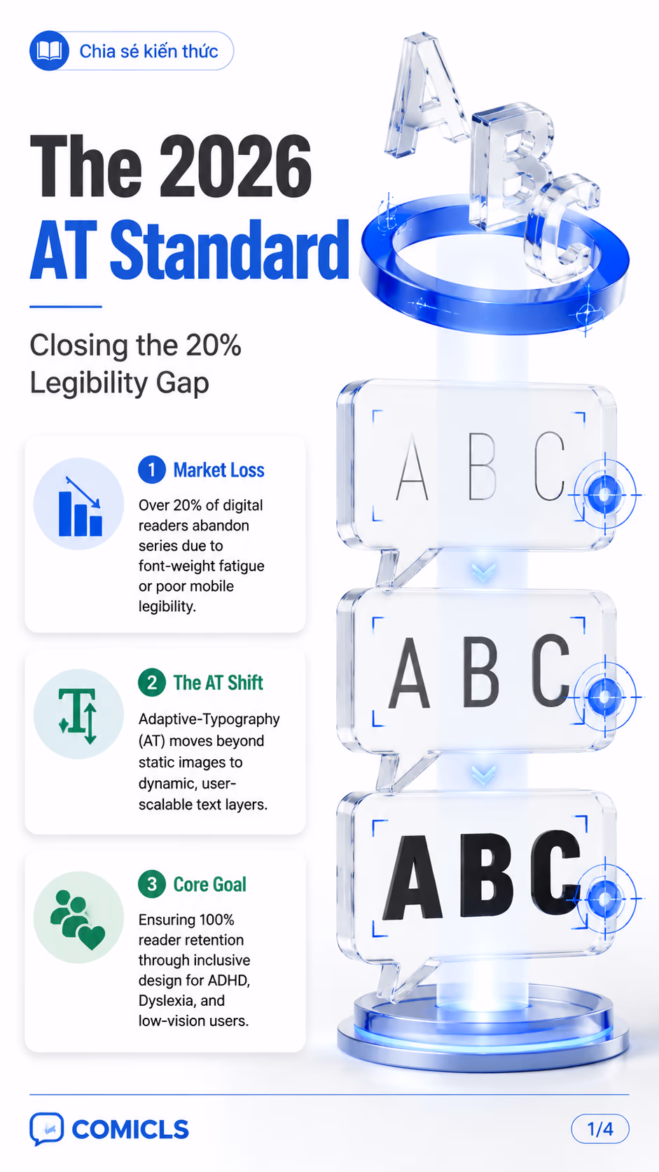
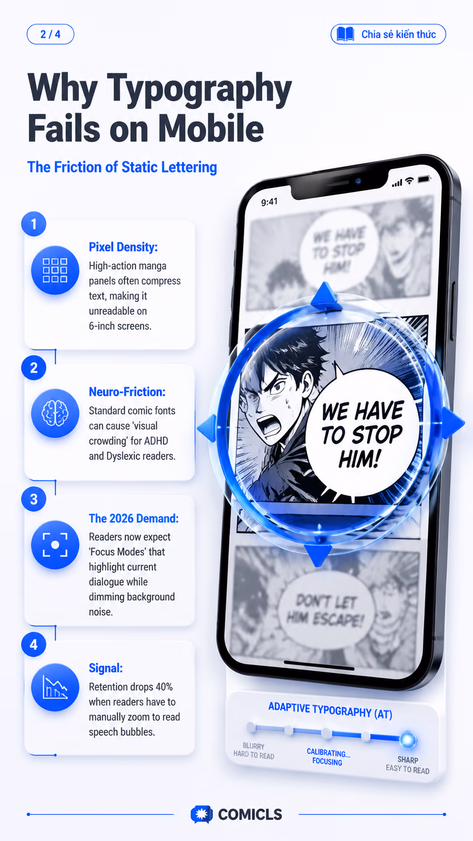
The 2026 Adaptive-Typography (AT) Standard marks a shift from 'aesthetic' lettering to 'functional' accessibility in the webtoon industry. As mobile reading becomes the dominant consumption method, creators can no longer afford to ignore the 20% of readers who struggle with static, low-contrast, or crowded text. This standard provides a framework for implementing variable fonts and dynamic spacing that adapts to the reader's cognitive and environmental needs.
- Learn why the AT Standard is crucial for retaining neurodivergent readers in 2026.
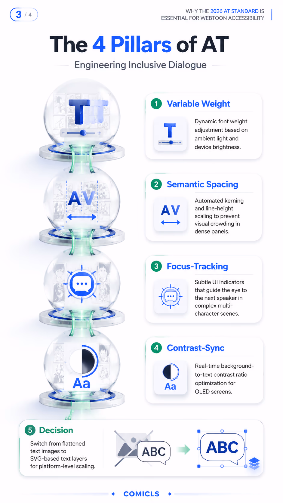
- Explore the 4 Pillars of AT: Variable Weight, Semantic Spacing, Focus-Tracking, and Contrast-Sync.
- Understand the technical shift from flattened text images to SVG-based dynamic layers.
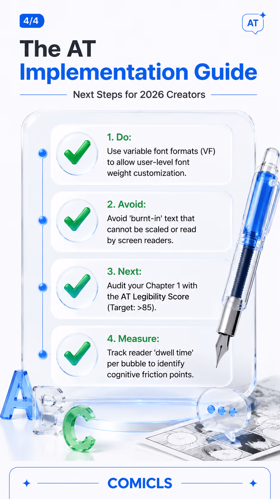
- Use the AT Implementation Guide to audit your comic for mobile legibility and inclusive UX.
FAQ
What is the AT Standard in webtoons?
The AT (Adaptive-Typography) Standard is a 2026 framework for creating dynamic, scalable, and inclusive text layers in webtoons to improve legibility for all readers.
How does AT help ADHD or Dyslexic readers?
AT reduces visual crowding through dynamic spacing and allows for specialized font weights that make character recognition easier for neurodivergent users.
Does AT require a special platform?
While it works best on platforms supporting SVG or dynamic text layers, creators can implement AT principles through smart font selection and panel layout design.