The Art of Audio-Visual Silence: Mastering Webtoon Lettering and SFX in 2026
Lettering is the invisible bridge between art and story. In 2026, mastering visual sound effects and mobile-first typography is essential for creator success.
In the 2026 comic landscape, the 'sound' of a story is seen, not heard. As webtoons and vertical-scroll manhwa continue to dominate global consumption, the role of lettering has evolved from a utilitarian delivery system for dialogue into a critical narrative tool. Lettering is no longer an afterthought; it is a rhythmic guide that dictates pacing, emotional weight, and reader immersion in an increasingly crowded digital attention economy.
The Psychology of Visual Sound: SFX as Narrative Anchors
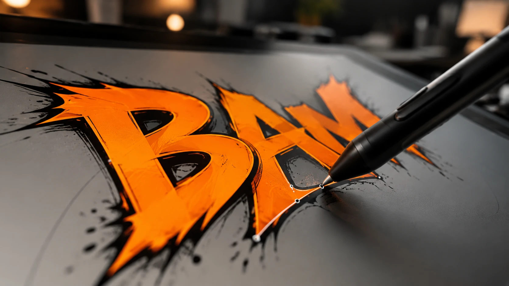
Onomatopoeia in 2026 has moved beyond simple 'Bangs' and 'Crashes.' Modern creators use sound effects (SFX) as visual anchors that draw the reader's eye down the vertical scroll. The shape, color, and placement of these words act as a second layer of cinematography. For instance, a jagged, vibrating font for a character's internal anxiety can convey more emotion than three panels of dialogue.
- Kinetic Integration: SFX should feel like they exist within the 3D space of the panel, interacting with characters and environments.
- Psychological Coloration: Using color theory in lettering to represent different 'frequencies' of sound—cool blues for subtle ambient noise and hot reds for high-impact action.
- Layering for Depth: Placing SFX behind characters or objects to create a sense of foreground and background within the infinite canvas.
Mobile-First Typography: Readability in the Palm of the Hand
With over 90% of webtoon consumption occurring on mobile devices, typography must be optimized for small screens. In 2026, the trend has shifted toward 'Dynamic Leading'—adjusting the space between lines and words based on the intensity of the scene. Creators are also moving away from generic comic fonts in favor of bespoke, brand-specific typography that enhances the IP's identity.
The 2026 Lettering Workflow: AI and Vector Precision
The modern letterer's toolkit has been revolutionized by AI-assisted placement and vector-based flexibility. AI tools now help creators automatically adjust speech bubble tails to point toward speakers or suggest font pairings based on the genre's mood. However, the 'human touch' remains vital for the expressive, hand-drawn SFX that give a webtoon its unique soul.
- Vector-First Approach: Using vector tools ensures that lettering remains crisp regardless of the zoom level or platform resolution.
- Global Compatibility: Designing lettering that allows for easy 'transcreation'—ensuring that SFX can be translated without destroying the underlying art.
- Automated Ballooning: Leveraging AI to maintain consistent margins and padding within speech bubbles, saving hours of manual labor.
Ultimately, the goal of 2026 lettering is 'invisible excellence.' When done correctly, the reader doesn't notice the font; they hear the voice of the character and feel the impact of the action. By treating typography as an extension of the art, creators can achieve a level of polish that distinguishes professional IPs from amateur projects.
FAQ
What font size is best for webtoons in 2026?
While it varies by font choice, a base size of 12pt to 14pt (at 72dpi) is generally the minimum for mobile readability. Focus on high x-height fonts for better legibility on small screens.
How do I handle SFX translation for global markets?
In 2026, the best practice is to keep SFX on a separate layer from the line art. This allows localizers to replace the visual sound effects with translated versions while maintaining the original artistic style.
Should I use different fonts for different characters?
Yes, but sparingly. Use distinct fonts for non-human characters (demons, AI, monsters) to signify a change in 'voice' tone, but keep the main cast within a consistent font family to avoid visual fatigue.