The 2026 'Visual Pacing' Masterclass: Using Variable Scroll Speeds to Control Reader Psych
Learn how to master the kinetic art of the vertical scroll by engineering reader velocity. This 2026 guide breaks down the technical ratios between panel height, white space, and psychological tension.
By 2026, the 'standard' vertical scroll has evolved from a simple delivery mechanism into a sophisticated psychological tool. In an era where reader attention is the primary currency, creators can no longer rely on static layouts. The modern reader’s thumb has a subconscious 'cruising speed,' and your job as a narrative architect is to disrupt that speed strategically. Visual pacing is the art of manipulating the physical distance between story beats to control the reader's dopamine release, anxiety levels, and emotional immersion. This guide outlines the 2026 framework for kinetic storytelling, moving beyond mere panel placement to the technical engineering of scroll velocity.
The Kinetic Ratio: Understanding Scroll Velocity
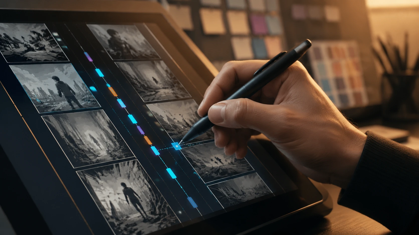
The core of 2026 visual pacing lies in the relationship between panel height and gutter depth. We define 'Scroll Velocity' as the speed at which a reader moves their thumb to reach the next narrative beat. If every panel is the same size, the reader enters a 'hypnotic skim'—a state where they process images but fail to retain emotional weight. To break this, creators must employ the Kinetic Ratio: a deliberate variation in vertical real estate that signals to the brain when to accelerate and when to linger. High-velocity sequences use short, rapid-fire panels to mimic a racing heart, while 'high-friction' sequences use massive gutters and vertically elongated panels to force a physical slowdown.
The Three Tiers of Narrative Friction
- Low Friction (The Sprint): Small, tight panels with minimal gutters (50-100px). Used for action, panic, or quick dialogue exchanges. This forces the reader to scroll quickly, mimicking a high-adrenaline state.
- Medium Friction (The Walk): Standard panel sizes with 'breathable' gutters (300-500px). Used for world-building and character development, allowing for a steady, comfortable reading rhythm.
- High Friction (The Anchor): Extremely tall panels or vast white spaces (800px+). Used for cinematic reveals, emotional gut-punches, or moments of profound silence. This forces the reader to perform a 'long scroll' before the next beat, building anticipation.
Step-by-Step: Architecting a High-Tension Sequence
To implement variable pacing, you must script for the scroll before you ever touch the canvas. Start by identifying the 'Emotional Anchor' of your chapter—the one panel that must stop the reader in their tracks. Everything before that point should be engineered to build velocity, and everything after should provide the 'cool-down.' This technical approach ensures that your story isn't just seen, but physically felt through the movement of the hand.
Workflow for Pacing Implementation
- Phase 1: Velocity Mapping. Mark your script with V (Velocity) or F (Friction) tags for each scene.
- Phase 2: The Gutter Audit. Review your storyboard. If you have more than three panels of identical height in a row, introduce a 'rhythm breaker'—a panel that is either 50% smaller or 200% larger.
- Phase 3: The Thumb Test. Read your draft on a mobile device. If your thumb never changes speed, your pacing is flat.
- Phase 4: Negative Space Optimization. Use the 'Void'—pure white or black space—to represent the passage of time or psychological isolation. In 2026, the space between panels is as important as the panels themselves.
Common Pacing Mistakes and How to Fix Them
The most frequent error in modern webtoon design is 'Gutter Fatigue'—the over-reliance on massive vertical gaps for every single scene. When every panel is treated as a masterpiece with 1000px of space, nothing feels special. The reader becomes bored and begins to 'hyper-scroll,' skipping over dialogue. Another critical mistake is the 'Visual Wall,' where panels are crowded together without regard for the mobile screen's aspect ratio, leading to cognitive overload. To fix this, always design with the 'Screen-to-Panel Ratio' in mind: never allow more than 2.5 panels to be visible on a standard 6.7-inch mobile screen at any given time, unless you are intentionally creating a sense of claustrophobia.
FAQ
What is the ideal gutter height for a standard webtoon in 2026?
While there is no single 'perfect' height, the 2026 industry standard for a 'breathable' transition is between 350px and 500px. However, this must be varied to maintain reader engagement.
How does scroll speed affect reader retention?
Data shows that 'monotonous scrolling' leads to higher drop-off rates. Variable pacing keeps the reader's brain alert, increasing retention by up to 40% compared to static-interval layouts.
Can AI help with visual pacing?
In 2026, AI-driven layout tools can suggest gutter widths based on the emotional sentiment of your script, but the final 'rhythm' should be manually tuned to ensure human-centric emotional impact.