The 2026 ‘Vertical Flow’ Optimization: Engineering Eye-Tracking Patterns for 60-Second Mob
Master the art of 'Vertical Flow' to capture the 2026 mobile reader's 60-second attention window. Learn how to engineer panel placements and gutter ratios for maximum ergonomic engagement.
In 2026, the battle for reader retention is won or lost in the first 60 seconds of a mobile session. As content saturation reaches its peak, the modern reader has developed a 'scanning-first' behavior, where eye-tracking patterns have shifted from traditional Z-patterns to a more aggressive, downward-propelling vertical scan. For webtoon creators and studios, simply stacking panels vertically is no longer sufficient. To maintain high LTV (Lifetime Value) and prevent 'scroll-past' churn, you must engineer your layouts using 'Vertical Flow' optimization—a methodology that aligns narrative beats with the ergonomic reality of thumb-scrolling and cognitive eye-rest positions. This guide breaks down the 2026 standards for engineering visual gravity in vertical storytelling.
The 2026 Ergonomic Reality: The 60-Degree Eye-Tilt
Recent 2026 biometric studies indicate that mobile readers now hold their devices at a more acute angle, leading to a narrower 'focus zone' in the center-third of the screen. This shift means that content placed in the extreme top or bottom edges of a single screen view is often perceived as 'peripheral noise' and is frequently skipped. To combat this, creators must adopt a 'Center-Weighted Narrative' approach. This involves placing the core emotional anchor—whether it is a character's expression or a critical dialogue bubble—within the central 40% of the screen's vertical axis. By doing so, you minimize ocular fatigue and allow the reader to maintain a steady scrolling rhythm without having to constantly refocus their gaze.
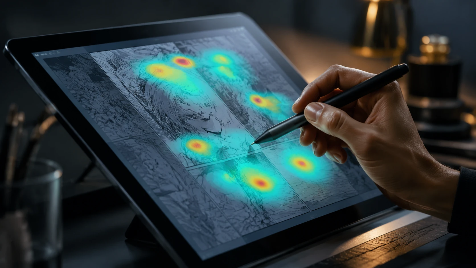
Step 1: Engineering 'Gravity Points' and Visual Hooks
A 'Gravity Point' is a visual element designed to catch the reader's eye during a high-speed scroll and force a momentary deceleration. In 2026, these are not just large panels, but strategically placed high-contrast assets. To implement this, every three to five panels should feature a 'Hook Asset'—a panel where the focal point is significantly more detailed or color-saturated than the surrounding panels. This creates a rhythmic 'breathe and catch' cycle. When the reader's eye hits a Gravity Point, their scrolling speed naturally drops by 15-20%, giving the surrounding dialogue and narrative context a higher chance of being processed rather than skimmed.
- Contrast Injection: Use a sudden shift in background value (dark to light) to signal a narrative shift.
- The 'Lead-In' Gutter: Gradually increase gutter space before a major reveal to build anticipation and slow the scroll.
- Visual Anchoring: Place a consistent visual element (like a specific color or character feature) in the same horizontal position across three panels to guide the eye downward.
Step 2: Optimizing Gutter Ratios for Cognitive Breathing
The 'Gutter' is no longer just empty space; it is a tool for cognitive load management. In 2026, the standard gutter-to-panel ratio has shifted toward 'Long-Form Spacing.' For intense action sequences, gutters should be tight (100-200px on standard mobile resolutions) to simulate rapid-fire movement. Conversely, for emotional or world-building moments, gutters should expand to 600-900px. This 'white space' acts as a buffer that prevents 'panel overlap' in the reader's short-term memory. If the information density is too high without adequate gutter space, the reader's brain triggers a 'friction response,' leading to session abandonment. Proper spacing ensures that each narrative beat is fully digested before the next one enters the focus zone.
The 1:2:1 Rhythmic Rule
A proven 2026 layout rhythm is the 1:2:1 rule: one establishment panel, followed by two tight-cropped interaction panels, followed by one wide-aspect 'reaction' panel. This sequence naturally mimics the way the human brain processes environmental changes, detail, and emotional response, creating a flow state that feels intuitive and 'invisible' to the reader.
Step 3: Text Bubble Displacement and Eye-Lead
One of the most common mistakes in vertical layouts is placing text bubbles in a way that fights the natural downward flow. The 2026 standard for lettering is the 'Descending Staircase' model. Instead of centering bubbles, they should be placed in a staggered, diagonal path that leads the eye from the top-left of the screen toward the bottom-right, then back to the center for the next panel. This 'zig-zag' movement is much more engaging for the eye than a purely linear vertical drop, as it utilizes more of the screen real estate and keeps the ocular muscles active without causing strain. Furthermore, always ensure that a text bubble's tail points toward the character's face, acting as a literal arrow for the reader's gaze.
Avoiding 'Vertical Fatigue' and Churn Points
Vertical Fatigue occurs when a series of panels feels monotonous in size and shape. To prevent this, avoid using more than three consecutive panels of the same aspect ratio. Break the pattern with 'Bleed Panels' (panels that touch the edge of the screen) or 'Floating Assets' (characters or objects with no panel borders). These breaks in the visual structure act as a 'reset' for the reader's attention. In 2026, the most successful webtoons are those that treat the vertical scroll like a musical composition—varying the tempo, the volume, and the silence to keep the audience synchronized with the story's heartbeat.
FAQ
What is the ideal gutter size for webtoons in 2026?
Standard 2026 layouts use variable gutters: 100-200px for high-speed action and 600-900px for emotional 'breathing' moments to manage cognitive load.
How do I prevent readers from skimming past important dialogue?
Use 'Gravity Points'—high-contrast or highly detailed visual elements—near the dialogue to naturally slow down the reader's scrolling speed.
Does panel width affect mobile reading speed?
Yes. Narrower panels encourage faster vertical scanning, while full-width 'Bleed Panels' create a visual 'stop' that encourages the reader to linger on the details.