The 2026 ‘Narrative Accessibility’ (NA) Standard: Engineering Comics for Neurodivergent Re
In 2026, accessibility has moved beyond screen readers to 'Narrative Accessibility' (NA), a framework for making comics more readable for ADHD, dyslexic, and sensory-sensitive audiences. Discover the technical and creative standards reshaping the inclusive comic market.
By 2026, the global comic industry has reached a critical realization: a significant portion of the 'churn' in digital reading is not due to poor story quality, but to cognitive friction. The 2026 ‘Narrative Accessibility’ (NA) Standard has emerged as the definitive framework for addressing this, moving accessibility from a simple 'alt-text' checkbox to a fundamental pillar of narrative architecture. This standard focuses specifically on neurodivergent readers—including those with ADHD, dyslexia, and sensory processing sensitivities—who represent over 20% of the global reading population. By engineering stories that respect cognitive load and visual processing limits, studios are seeing a marked increase in long-term reader retention and global market penetration. This isn't just about inclusivity; it is about optimizing the very mechanics of how humans consume visual information in a high-distraction digital age.
Defining the 2026 NA Framework
Narrative Accessibility (NA) is the practice of designing comic layouts, pacing, and text to minimize the 'processing tax' on the reader's brain. Unlike traditional accessibility, which focuses on physical impairments, NA addresses neuro-narrative hurdles. For a dyslexic reader, a stylized, handwritten font in a cramped bubble is a barrier. For a reader with ADHD, a panel layout with no clear focal point leads to 'scroll fatigue' and abandonment. The 2026 standard provides a technical roadmap for creators to build 'cognitive ramps' into their work, ensuring that the story's emotional impact isn't lost to the struggle of decoding the page. This involves three primary vectors: typographic clarity, visual anchoring, and rhythmic pacing.
The Three Pillars of Cognitive-First Design
1. Typographic Sovereignty and Legibility
In the NA framework, font choice is no longer purely aesthetic. The 2026 standard mandates 'Dyslexia-Friendly' variants for all major platform releases. These include fonts with weighted bottoms to prevent 'letter-flipping' and increased kerning to avoid visual crowding. Furthermore, the ratio of text-to-bubble size is strictly managed. Speech bubbles now utilize a minimum of 20% negative space around the text to prevent 'text-block anxiety,' a common cause for drop-off among younger readers. Creators are also moving away from all-caps lettering for long exposition, favoring sentence-case which provides more distinct word shapes for faster recognition.
2. Visual Anchoring and Focal Flow
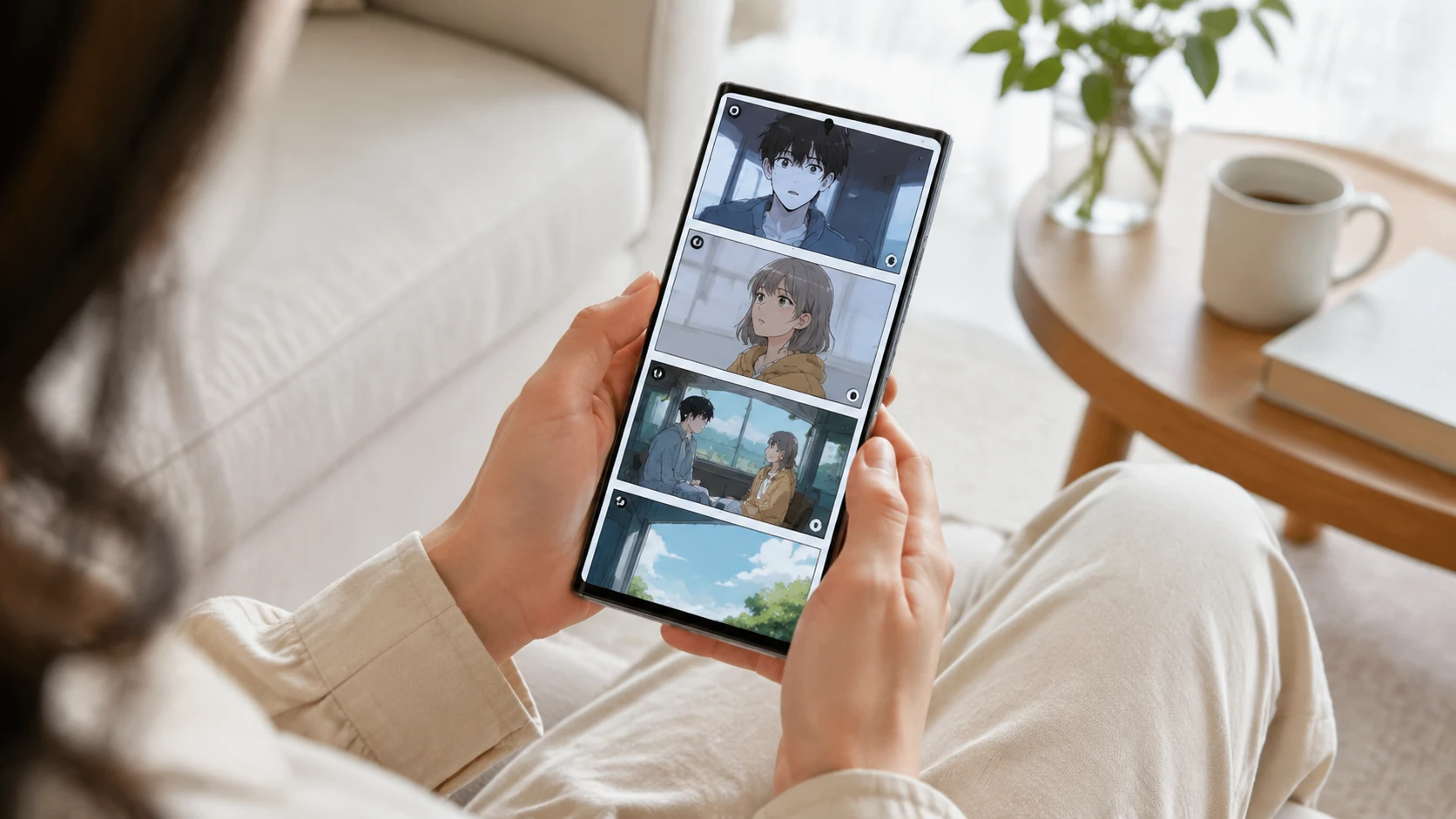
To support readers with executive function challenges, the NA Standard introduces 'Visual Anchors.' These are subtle recurring motifs or compositional markers that guide the eye through complex vertical scrolls. In 2026, many top-tier webtoons use a 'Gutter-Guide' system—varying the width of the space between panels to signal narrative shifts (e.g., wider gutters for time jumps, narrower for fast action). This provides a constant spatial reference point, preventing the 'lost in the scroll' feeling that occurs when layouts become too experimental or chaotic.
3. Sensory Load Management
High-saturation palettes and 'shaky-cam' effects are common in action comics, but they can trigger sensory overload in many readers. The NA Standard encourages the use of 'Luminance Balancing.' Studios now use software to ensure that contrast ratios between panels aren't so jarring that they cause physical eye strain or cognitive 'glitch' during rapid scrolling. By maintaining a cohesive color temperature throughout an episode, creators can keep the reader in a 'flow state' longer, directly boosting session duration metrics.
Implementing NA in the Production Workflow
Integrating the NA Standard does not require a complete stylistic overhaul. Instead, it involves a 'Cognitive Audit' at the storyboard phase. Creators use the following 2026 checklist to ensure compliance:
- Focal Point Check: Does every screen height have one clear primary focus?
- Text Density Audit: Are there more than 3 bubbles per panel? If so, can they be broken up?
- Contrast Verification: Are background elements distinct enough from character silhouettes to prevent visual merging?
- Font Toggle Ready: Is the script layered such that readers can toggle between 'Artistic Font' and 'NA-Standard Font' in the app?
- Rhythmic Pause: Is there a 'breathing panel' every 5-7 panels to allow the reader to reset cognitive load?
The Business Case: Tapping into the 'Invisible' Market
Data from the 2025 Market Resilience Report showed that NA-compliant webtoons saw a 35% higher 'completion-to-payment' rate compared to non-compliant titles. Neurodivergent readers are often the most loyal and vocal fans when they find content that respects their processing needs. Furthermore, the NA Standard is becoming a requirement for Tier-1 educational licensing and library distribution. As governments and educational bodies move toward digital-first curricula, comics that adhere to cognitive accessibility standards are the first to be selected for multi-million dollar institutional contracts. In the 2026 economy, accessibility is the ultimate competitive advantage.
Common Pitfalls: The 'Style vs. Accessibility' Myth
A common mistake among legacy artists is the belief that Narrative Accessibility stifles creativity. In reality, some of the most visually stunning works of 2026 are those that use NA constraints to innovate. For example, 'The Silent Shore' uses strict NA visual anchoring to create a sense of deep immersion that actually enhances its eerie, atmospheric style. The pitfall is viewing accessibility as a limitation rather than a set of 'best practices' for human-centric communication. When you design for the most cognitively taxed reader, you create a better experience for everyone.
FAQ
What is the primary difference between NA and traditional accessibility?
Traditional accessibility focuses on physical tools like screen readers or alt-text. Narrative Accessibility (NA) focuses on the cognitive layout—font legibility, visual focal points, and pacing—specifically for neurodivergent readers.
Will implementing NA standards make my comic look boring?
No. NA is about clarity, not simplicity. It provides frameworks for guiding the eye and reducing friction, which can actually allow for more complex art that remains readable.
Is there an automated tool to check for Narrative Accessibility?
Yes, in 2026, platforms like COMICLS offer 'Cognitive Load Heatmaps' that analyze your panels for focal points and text density before you publish.