The 2026 Hybrid Layout Blueprint: Mastering Multi-Surface Narrative Architecture for Webto
In 2026, the era of drawing a comic twice for different formats is over. This guide introduces the Hybrid Layout Blueprint, a framework for building surface-agnostic narrative assets that maximize IP ROI.
The 2026 comic market is no longer defined by a single screen or a single page. With the stabilization of foldable devices, the mainstreaming of AR-integrated reading, and a massive resurgence in luxury physical 'collector' editions, creators are facing a 'format fragmentation' crisis. Drawing a series once for a vertical scroll and then redrawing it for a trade paperback is a relic of the early 2020s. Today, successful studios utilize the Hybrid Layout Blueprint—a strategic framework that allows a single production cycle to output assets perfectly optimized for mobile, print, and spatial interfaces. This guide breaks down the technical and creative shift from static paneling to modular narrative architecture, ensuring your IP is ready for every surface a reader might choose.
The Shift from Static Pages to Fluid Narrative Architecture
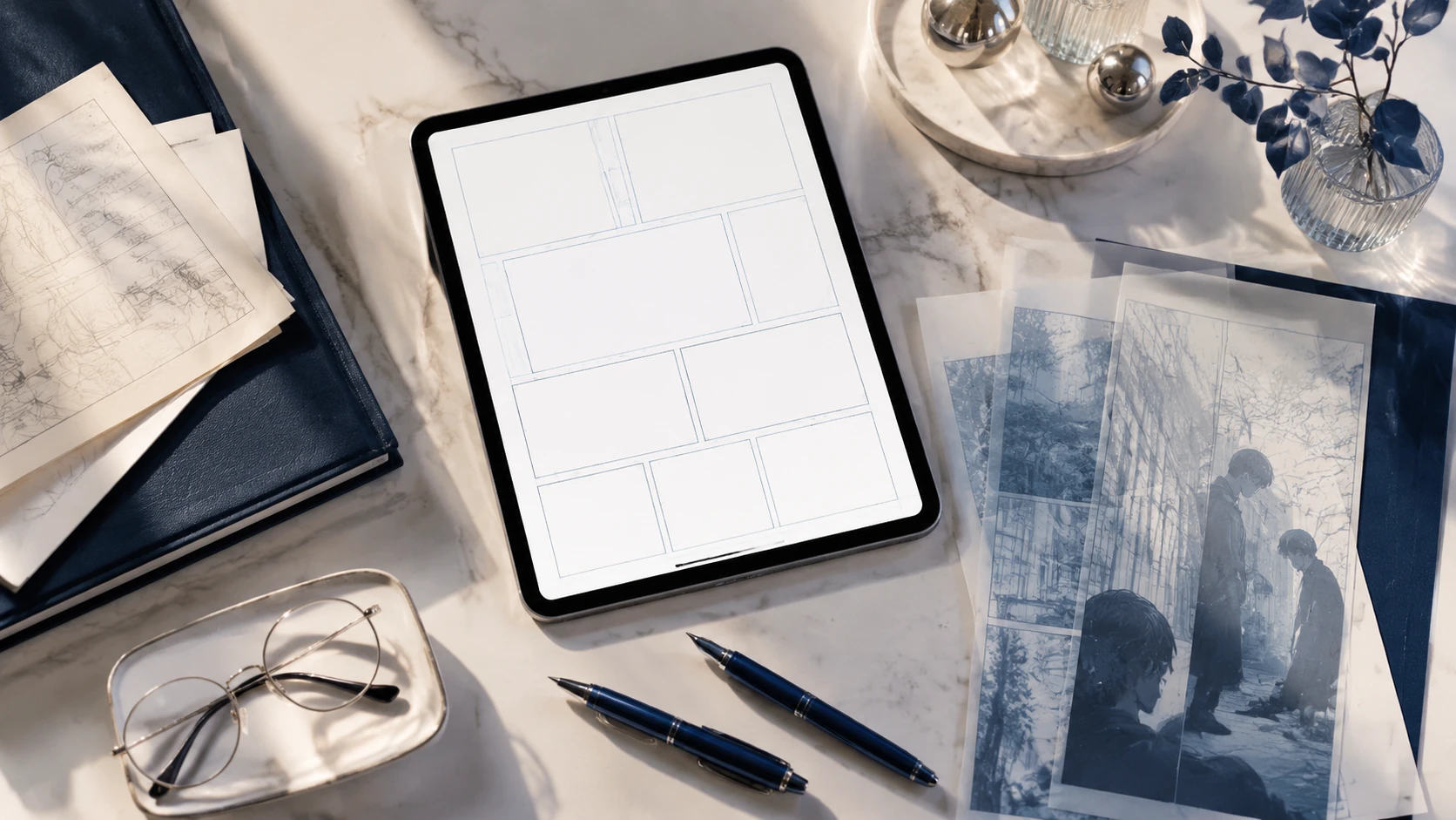
Traditional comic design focused on the fixed boundary of the page, while early webtoons focused on the infinite vertical descent. In 2026, we treat the comic as a 'Responsive Narrative Entity.' Instead of drawing panels into a container, creators are now designing 'Narrative Modules'—self-contained visual units that can be reflowed based on the viewing environment. This requires a fundamental shift in how we perceive the 'gutter.' No longer just white space between panels, the gutter in a hybrid workflow acts as the flexible anchor point for responsive design. By planning your narrative in modules rather than fixed pages, you eliminate the need for costly post-production reformatting and ensure that the emotional pacing remains consistent whether a reader is scrolling on a 6-inch phone or flipping through a 10-inch hardcover.
Designing for the 'Golden Ratio' of 2026 Display
- The 1:2 Vertical Anchor: The primary scroll ratio for mobile verticality.
- The 4:5 Foldable Standard: The expanding market for mid-size square-ish displays.
- The 11.7-inch Print Safety Zone: Ensuring your modular panels fit standard archival print sizes without cropping vital details.
The 'Safe-Zone' Framework: Balancing Verticality and Page-Turns
The core of the Hybrid Layout Blueprint is the 'Safe-Zone' method. When sketching your storyboards, you must visualize two overlapping grids simultaneously. The central column (approx. 60% of the canvas width) contains the critical 'Narrative DNA'—dialogue, facial expressions, and key action beats. The outer margins are reserved for 'Atmospheric Extension'—background art and environmental details that can be cropped for mobile or expanded for double-page print spreads. This 'Safe-Zone' approach ensures that your focal points never get cut off by platform UI or trapped in a physical book's gutter. It allows the eye to follow the 'Eye-Path Economy,' maintaining a downward flow for webtoon readers while naturally leading to a 'page-turn' beat for print readers.
Step-by-Step: The 2026 Hybrid Workflow
To implement this blueprint, your studio must adopt a modular production pipeline. This isn't just about software; it’s about the order of operations in your creative process. By decoupling the art from the layout early in the process, you gain the agility needed to dominate multiple markets simultaneously.
- Phase 1: Semantic Scripting. Tag dialogue beats as 'Primary' or 'Contextual' to allow for font scaling across devices.
- Phase 2: Modular Storyboarding. Sketch panels as independent assets on a high-resolution canvas (600 DPI minimum for 2026 print standards).
- Phase 3: The Master Layout. Arrange panels in a vertical scroll, ensuring that the distance between modules dictates the emotional timing.
- Phase 4: Automated Reflow. Use 2026 layout tools to snap these modules into a multi-page grid, using your 'Safe-Zone' metadata to guide the placement.
- Phase 5: High-Fidelity Finishing. Finalize the art across the full bleed to ensure the assets are ready for large-format physical printing.
Common Pitfalls: Why 1:1 Conversions Fail
The biggest mistake creators make in 2026 is 'The Lazy Export'—simply stacking print panels vertically or trying to force a webtoon's long-form vertical assets into a grid without adjusting for timing. This leads to 'Narrative Dyslexia,' where the reader’s eye gets lost in the layout. In a vertical scroll, white space represents time and breath; in print, white space is often perceived as a lack of content. To avoid this, the Hybrid Layout Blueprint suggests using 'Bridge Assets'—smaller, atmospheric panels that can be hidden in print but used to extend the scroll on mobile. These bridges maintain the 'scroll velocity' that webtoon readers expect without cluttering the physical page.
Conclusion: Future-Proofing Your Narrative IP
As we look toward the 2027 horizon, the distinction between 'webtoon creator' and 'comic artist' will continue to blur. The most successful IPs will be those that feel native to whatever device the reader picks up. By adopting the Hybrid Layout Blueprint today, you aren't just making your production more efficient; you are building a sovereign IP that is technically and aesthetically ready for the next decade of publishing evolution. Your stories deserve to be read everywhere—ensure your layout doesn't stand in the way.
FAQ
What is the best resolution for hybrid comic layouts in 2026?
The 2026 standard is 600 DPI on a canvas width of at least 3200 pixels. This ensures that assets remain crisp on 8K mobile displays while meeting the requirements for premium physical printing.
Can I use AI to automate the reflow from vertical to print?
Yes, 2026 layout tools use semantic tagging to assist in reflowing modules, but manual oversight is required to ensure 'eye-path' integrity and emotional pacing.
How do I handle speech bubbles in a multi-format layout?
Use vector-based lettering with semantic anchors. This allows bubbles to resize and reposition themselves automatically when switching between vertical and grid layouts.