Is Your Webtoon Unreadable Outdoors? The 2026 PC Audit
Stop losing readers to screen glare. Master the 2026 Panel-Contrast (PC) Audit to optimize your webtoon's luminance values for outdoor mobile reading.
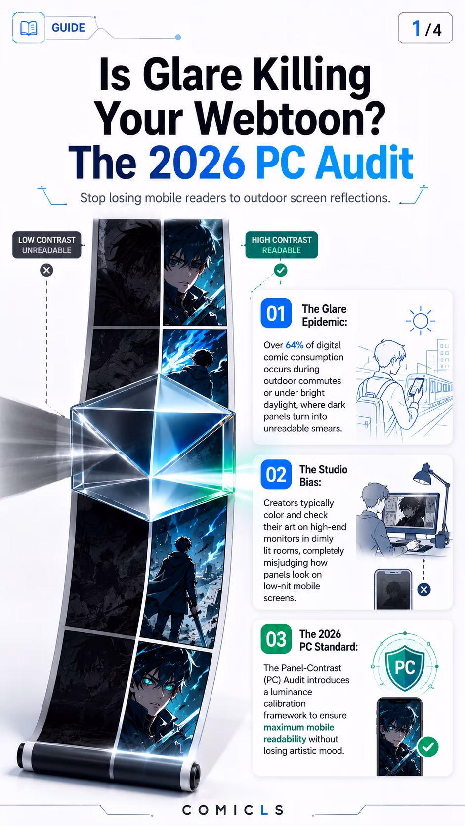
The mismatch between where creators draw and where readers read is a primary source of unrecognized subscriber churn. While webtoon and manga artists typically work on color-accurate monitors inside dim, professional studios, over half of their mobile audience reads on-the-go. In bright daylight, normal screen glare obliterates dark tones, turning intricate combat scenes or moody night sequences into incomprehensible black blobs. The 2026 Panel-Contrast (PC) Audit solves this drop-off issue by introducing an actionable testing framework.
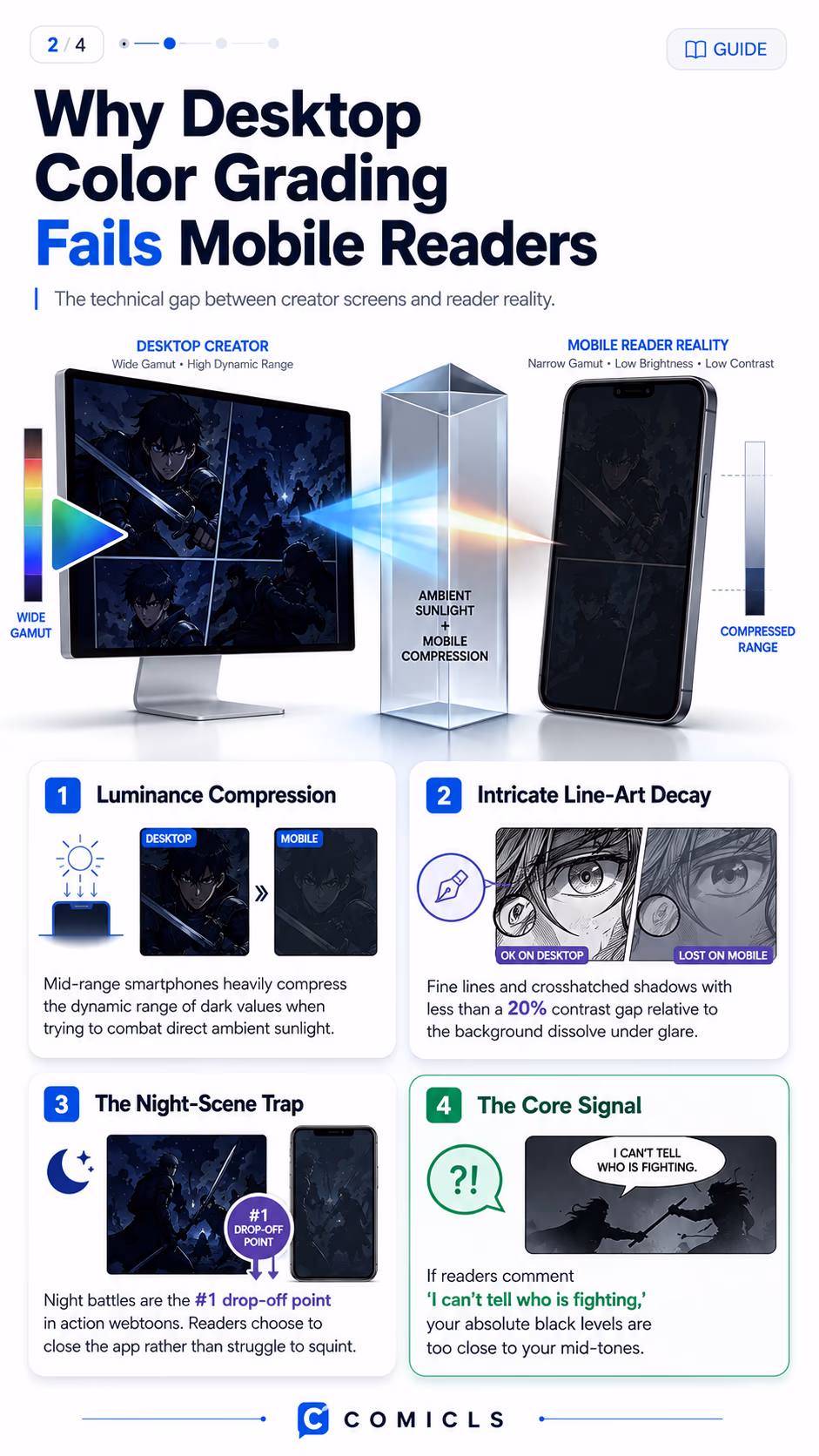
- Learn why desktop color grading fails on consumer-grade mobile screens under direct sunlight.
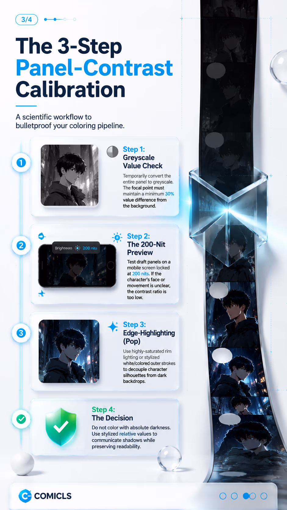
- Discover the 30% greyscale value difference rule to ensure characters pop out of dark environments.
- Implement a mobile 200-nit preview pass to catch unreadable panels before publishing.
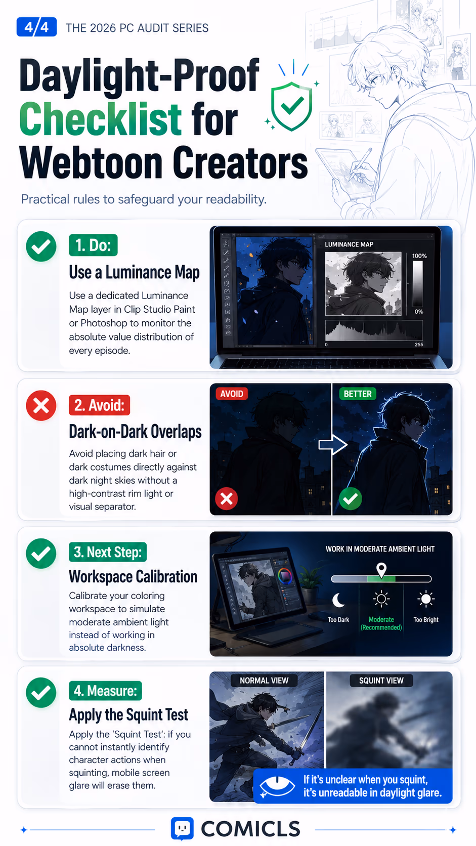
- Use edge-highlighting and luminance maps to maintain atmospheric mood while safeguarding visibility.
FAQ
What is the 2026 Panel-Contrast (PC) Standard?
It is a production metric that ensures digital comic panels remain fully legible under outdoor glare. It mandates a minimum 30% luminance difference between key focal subjects and background scenery.
Does contrast calibration ruin the atmospheric mood of night scenes?
No. By using relative value scaling and stylized high-contrast rim lighting rather than muddy black values, you can preserve a dark, moody environment while keeping the story readable.
How do I easily test outdoor readability in Photoshop or Clip Studio Paint?
Create a top correction layer set to saturation: 0 (greyscale). If your key elements blur into a uniform shade of grey, increase the luminance contrast of your lighting or highlights.